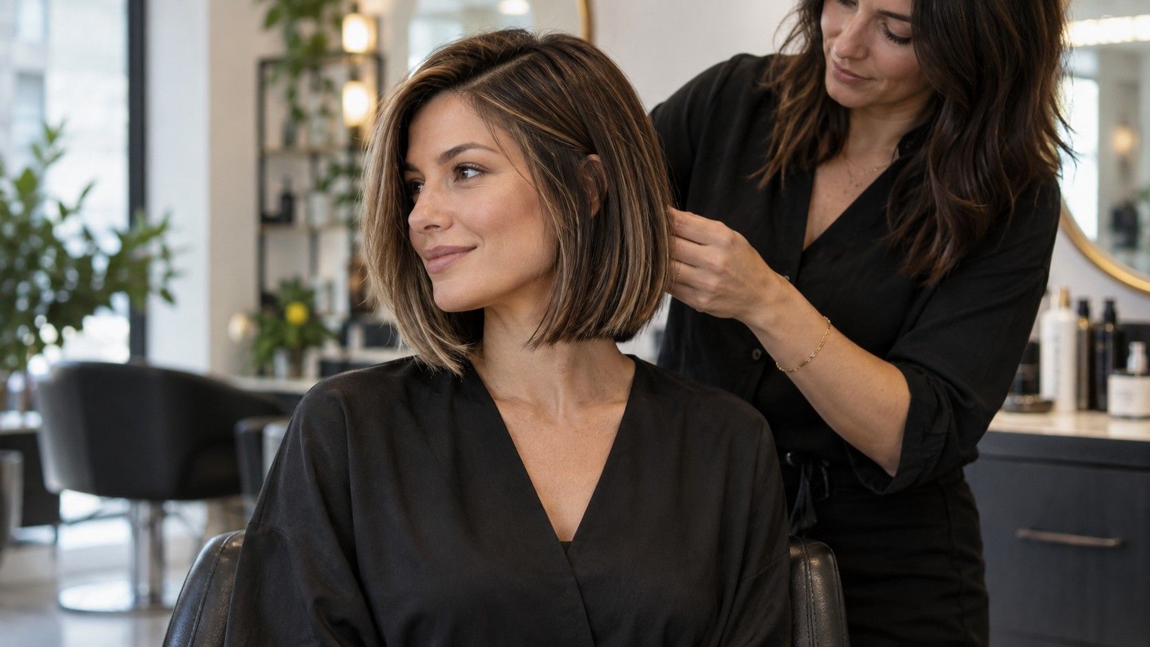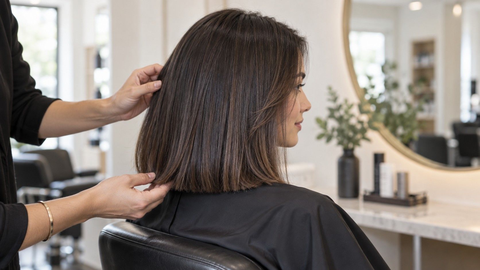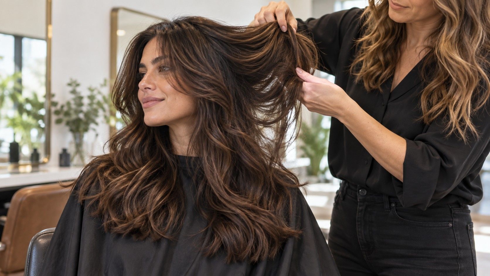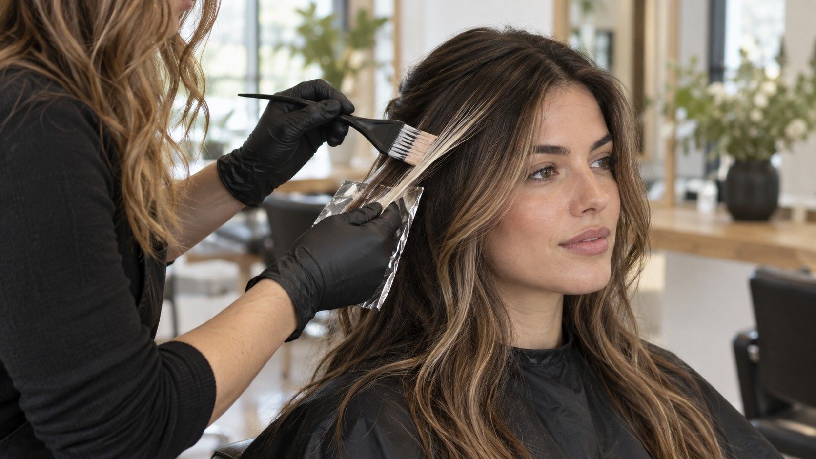
Face-framing highlights can make a familiar haircut look newly awake, but the nice before-and-after photos leave out the awkward question: what will those pale front pieces look like six weeks later, under a centre part and ordinary daylight? Good placement is not simply two bright ribbons beside the face. It is a decision about the hairline, your usual part, the contrast your natural base can carry, and how much salon maintenance belongs in your real schedule.
First decide what you want the brightness to do
People use the phrase face framing highlights for several quite different looks. A soft balayage frame may be only a shade or two lighter and start away from the root. A classic money piece is much more obvious: a narrow bright panel at the front, often taken close to the scalp. Neither is inherently more flattering. The useful starting question is whether you want someone to notice the colour from across a room, or whether you want your skin and eyes to look a little clearer when you catch yourself in a mirror.
Look at your natural hairline before choosing. Most hairlines are not an even semicircle. There may be finer hairs at the temples, a little recession on one side, or a cowlick that changes where the front sections fall. A pale highlight placed too solidly on those fine hairs can make the line look less natural, not more luminous. A stylist who paints around the edge rather than tracing it like a marker usually gets a softer result.
Your normal part matters just as much as the colour formula. With a centre part, the two front panels appear side by side and any difference in width is easy to see. With a soft side part, one side may carry more hair, so identical foils can look unbalanced once you leave the chair. Arrive wearing the part you actually keep at work or on weekends. Changing it for a polished salon photo is one of the quickest ways to approve a placement that does not make sense at home.
There is also a distance test. Stand a few steps back from the mirror, then move close enough to inspect the hairline. If the colour only works at one distance, it is probably too extreme for the goal. Gentle face framing should read as light moving through the front. A high-contrast money piece can read as a deliberate graphic detail, but it needs a cut and styling routine that support that choice.
Width and contrast should follow density, not a trend photo
The width of a face frame changes its character more than most colour names do. A very narrow weave near the part gives a flicker of brightness and is easy to blend into balayage. A broad slice that reaches from the part to the temple becomes the main event. On fine hair, wide bright panels can make the front look transparent because there is less darker hair behind them. On dense hair, the same panels may disappear unless they are bright enough to hold their own.
Contrast is the second lever. If your base is dark brown and the front is lifted to a light beige blonde, the hairline will announce itself even when the rest of the hair is tied back. That can be striking, but it is not low maintenance. A warmer caramel or dark blonde frame may give nearly as much definition while allowing the root to grow in with less drama. The most useful reference photos show a similar base colour and density to your own, not merely a similar face shape.
| Placement choice | What it usually looks like | Useful check before booking |
|---|---|---|
| Fine woven frame | Soft light around the part and temples | Best when you want subtle regrowth and often wear hair down |
| Medium painted panels | Visible brightness that still blends into balayage | Ask where the colour will fade into the mid-lengths |
| Bold money piece | Clear, high-contrast front streaks | Decide whether you are happy to tone or refresh it regularly |
| Rooted face frame | A soft gap at the scalp before the brightness begins | Helpful when you prefer longer intervals between appointments |
Brightness does not need to be icy to look fresh. Beige, honey, copper and softly warm tones can frame the face beautifully when they agree with the rest of the colour. The trouble often starts when a cool toner is placed over hair that naturally lifts warm, then fades unevenly after several washes. Ask what the underlying lift is likely to be and how the tone will change, rather than choosing a shade name from a ring light photograph.
A small practical clue: notice whether you wear your hair tucked behind your ears. When the front is tucked, a wide, bright slice can look much heavier because it becomes a single block against the skin. A finer weave or a softly blurred root tends to look more natural in that position. This is worth testing with a clip during the consultation, particularly if glasses, headphones or a bike helmet are part of your day.
Place the light around the part you actually wear
Centre parts reward careful symmetry, but not mechanical symmetry. The two sides should have a similar visual weight once the hair has dried and fallen naturally, which may mean the stylist uses a slightly different amount of hair on each side. If one temple has a stronger growth pattern, forcing both panels to start at exactly the same point can produce two different-looking streaks. It is better to balance the finished effect than to make the foil map look perfectly mirrored.
With an off-centre part, the fuller side often benefits from a diffused piece that begins close to the part and melts through the temple. The smaller side may need less colour so it does not become a pale isolated stripe. This is where a painted balayage-style face frame can be more forgiving than two crisp foils. It respects the way the hair moves rather than trying to make the head look like a flat front-facing picture.
If you switch partings constantly, tell the colourist. A very strong money piece can vanish under a side part and reappear as a strange thick line when you move back to the middle. Fine babylights around the hairline, plus a couple of slightly brighter strands near the front, travel better between partings. They are less dramatic on day one, but they often look better during the months when you stop styling for photographs.
The section behind the ear deserves attention too. A frame that ends abruptly at the temple can look pasted on when you turn your head. The nicest versions usually have a few connecting lights through the side, enough to make the front feel related to the rest of the balayage. That does not mean every piece needs to be blonde. It means the colour should have somewhere to go.
Use the hairline carefully, especially around fine baby hairs
There is a difference between getting brightness close to the root and painting every hair at the root. The latter can look harsh on a natural hairline because the short, fine hairs catch the light most strongly. A little shadow at the scalp gives the eye a transition, even when the lengths are noticeably lighter. It also makes the first centimetre of regrowth much less conspicuous.
Ask whether the face framing highlight placement will be feathered at the root. Feathering means the colour is applied with a soft, staggered edge rather than a solid horizontal stop. It is especially useful for people who like a brighter front but do not want to return every four weeks. A root shadow can serve the same purpose, though it should be subtle enough that it does not make the front look dirty or flat beside a fresh blonde length.
At the temples, the answer is often fewer pieces, not more. Temples can be naturally finer and more fragile, particularly if you frequently pull hair back. Repeated high lift on a thin section is an easy way to get breakage that looks like a bad haircut. A good colourist will assess the condition there, use appropriate protection, and leave some natural depth instead of chasing maximum lightness.
That caution applies even more if you have recently used box dye, henna, a smoothing treatment, or a darker gloss. Those histories affect how the front can lift, and the hairline does not need to be the place where a colour correction is tested. Be straightforward about previous colour. A slower approach with a warm, wearable first session is much better than a pale front section that feels dry and starts snapping before the toner has faded.
Plan toner and regrowth before you ask for the brightest version
Face-framing highlights are often described as low maintenance, but that statement needs a footnote. The placement may grow out softly, especially when the root is diffused, while the tone still needs attention. Very light hair can turn warmer, duller or more porous between visits. If you strongly prefer cool beige or pearl blonde, a toner appointment may be useful even when you are not ready for more lightening.
How often you need that visit depends on the level of lift, your water, heat styling and shampoo habits. Some people like the soft warmth that appears after a few weeks; others notice brassiness immediately. Rather than committing to purple shampoo as a cure-all, ask what tone is expected to emerge and which product, if any, makes sense for your specific colour. Purple products can leave pale porous pieces smoky or uneven when used too often.
Regrowth is easiest when the frame has depth at the root and fine transitions through the mid-lengths. You may be happy with a gloss at six to eight weeks and new lightening after three or four months. A bold money piece taken right to the scalp usually asks for a faster rhythm if you want it to remain intentional. There is no wrong schedule; there is only a mismatch between the appointment calendar and the contrast you chose.
Budget for the colour you are actually asking for, not the name attached to it. A small bright frame may be quick to paint but still require detailed foiling, careful toning and a cut that shows it off. Bring a realistic idea of how often you can return. The colourist can then choose a root melt, a lower contrast or a more dispersed weave that gives you the same general feeling without turning every appointment into an emergency refresh.
Avoid the stripe effect with a few clear consultation details
The stripe effect usually comes from one of three things: panels that are too wide, a hard root line, or brightness that has no connection to the rest of the hair. It can also happen when every strand in the front is lifted to the same pale level. Natural-looking light has variation. A slightly deeper piece beside a brighter one gives the eye somewhere to rest and keeps the frame from looking like two printed bands.
Reference photos help, but choose them as evidence rather than instructions. Bring one image for the brightness you like, one for the root softness, and one showing the amount of contrast that feels comfortable. Then point out what you do not want: perhaps chunky 1990s-style streaks, a pale line at the scalp, or a frame that looks disconnected when hair is up. That negative information can be more useful than a dozen identical blonde photos.
Before the cape comes off, ask to see the colour in a few honest positions. Look with the part moved slightly, hair tucked behind each ear, and the front pulled into a loose ponytail. Check it in daylight if possible. Salon lighting can make a strong highlight look softer than it will at a café window or in the car. You are not looking for perfect sameness from every angle; you are checking that no solid bar suddenly appears when you move.
The best face framing highlights are not necessarily the brightest ones. They are the pieces that continue to make sense after the gloss has softened, the roots have grown, and you have gone back to your own rushed styling habits. When width, tone and root placement are chosen with those ordinary days in mind, the colour feels like part of your hair rather than a temporary effect laid on top of it.